Showing posts with label color theory. Show all posts

06 July 2016

Poem-A-Day #128 : Green

I was just as obsessed by colors and light as an 18 year old as I am as a 35 year old. Below the poem in my journal is one of my favorite bits of poetry. From David P. Young's The Man Who Swallowed A Bird:
Once I swallowed a bird,
felt like a cage at first, but now
sometimes my flesh flutters and I think
I could go mad for joy.


The original:

Green (3/17/99)

Calm, cool
The color of springtime country
Makes me long for tall grass
to run through
roll in
Lay and look at the sky
Surf the endless
fields of ocean
Calm, cool
Next to anything it is
perfect
Always relaxing
Nature in color


The edit:

Green

Long for the tall grass - the shade of big land
the stalks - thick and whip-like

The sound of speed - of knee high by the fourth of July
the thickness of summertime maple leaves

The sky bleaches against all this boiling pigment
all of this dampness - this scent of grass

The most restful of states - run in it - let it stain your jeans
the feeling of wet - the prime of your life

01 May 2016

Poem-A-Day #62 : Fusion

Fusion

Ink on water - the shooting lines
are instant and then sudden - they pause
before combining

They darken then vanish

Lines of veins pumping across hydration
- absorb this and then release
in pink and running glass

31 March 2016

Poem-A-Day #31 : Night

Night

          Blue shadow on the cheek

                    Smudge of gray ash in the fireplace

                              At night the vines hug the walls they are heart-shaped purple and bleeding on the bricks

          I'd say they were bougainvillea but that's obvious they may as well be ivy itching at the stone walls and pulling mortar from the cracks hiding animals hiding so many windows

                    You hide blue with orange

                              The cadmium is opaque is breaking

           In the YouTube video they show the woman covering the man's face with thick tangerine-colored concealer then with thick beige concealer then with rouge

          I don't get a five o'clock shadow

                    The bricks pop and fall the mirror hides itself

25 February 2013

Pantone

Pantone was founded in the 1950s in New Jersey. It is now best known for those fan-shaped booklets of color charts. They have a proprietary system of color coding, PMS, that is used by fashion designers and governments alike.

Pantone claims that the color numbers and pigment values for all 1114 colors in their PMS are intellectual property. In other words, they believe they own the makeup of the colors.

Honeysuckle...apparently.
Every year they hold a meeting to pick the color of the year. The color that most matches the zeitgeist of the moment. In 2011 they picked Honeysuckle and said this about the choice:

In times of stress, we need something to lift our spirits. Honeysuckle is a captivating, stimulating color that gets the adrenaline going – perfect to ward off the blues.

2013 is the year of Emerald. Here is what they say:

Emerald brings a sense of clarity, renewal and rejuvenation, which is so important in today's complex world.

And I mean...sure. We need rejuvenation. And I do love me a jewel tone. But...really? And the descriptions are really similar. Honeysuckle is stimulating and will get adrenaline going and Emerald will aid rejuvenation. I guess I'm not seeing a difference.

Tell me that pink makes us think of birth, of spring, that it reminds of of life. Tell me that green is vibrant, is life in full blush, is summer. Give me something a bit more...evocative of color.

The Cotswolds. Every year is Emerald.
Color is emotion. Is sense memory. That deep green reminds me of the western coast of Wales. Of the long expansive fields dotted with crags of steel-colored rock. There are probably sheep out there. Maybe mythical creatures. It reminds me of my childhood. Of a long bike ride through the Cotswolds that ended at a large tower in the middle of nowhere. The sun was dappled and I was wearing a neon green hat that said 'London' across the front of it. I probably had on acid-washed jeans. Because I was a baller when I was 12.

The pink makes me think of pigs. That makes me think of Charlotte's Web. Which makes me sad. But in a really great nostalgic kind of way. I'm thinking of the annual Centre County Grange Encampment and Fair in Pennsylvania. There are these long tents full of pens of animals, each a prize-winner or an attempted winner. Rows of rabbits, chickens, pigs, cows, ponies. Crates of vegetables and pies. The grange in PA is one of the few left where people stay over in tents on the property. The waiting lists are so long that the tents are willed to the next generation to keep hold of them. My father's mother shared a tent with her sister. People would build out the tents to have working showers, kitchens, porches. They pimped that shit out. And it was terrible-fabulous.

These are the things color brings up. Not rejuvenation. Not stimulation. Those are dull PR words for 'buy our shit'. Pantone is stupid for thinking it can copyright memory or nature. It would be telling me that a smell is not mine. That the way magnolias makes me cry is somehow not mine. That the color of the sky in early fall is not mine. That the fogged glass after a hot shower is not mine.

I will allow 2013 to be the year of Emerald if for no other reason then it means I can imagine an endless bike ride in the middle of nowhere every day. I will not allow that Pantone had anything to do with getting me there.

08 August 2012

Dust Jacket : Phenomenology of Perception

Phenomenology of Perception (1945)
Designed by: Keenan

I've highlighted the work of Jaime Keenan before. That time I was discussing an example of his work that I felt fell flat. He is a great designer and this, I hope, highlights that.

If the cover looks familiar it is because it should. Over the years of public education you were perhaps taken into various rooms and given tests. One where you put headphones on and were asked to raise your hand when you heard a tone, one for scolio, and the one depicted on this cover.

The Ishihara Color Test. The image on the cover is plate number 9. It shows a 74. If you are partially color blind you may see a 21. If you are full color blind you will see nothing.

The Ishihara test was invented by Japanese ophthalmologist Shinobu Ishihara in 1917. The test was initially used by the Japanese military to test recruits. The first charts were hand-painted by Ishihara with water colors.

As I said this is an example of a great cover designed by Keenan. The book is Merleau-Ponty's work on perception and how the body is a prime focus for how man deals with the world. What better way then to showcase the ultimate test of perception. There are also cases where physical damage to the eye can result in color blindness, damage to the body and how it changes perception features in the book as well.

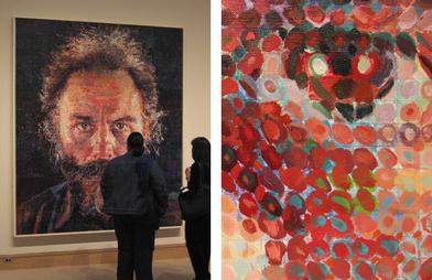
All these dots have me thinking about two artists, both deal with perception and use spots to interpret the world. The first is Chuck Close, whose images closely resemble the Ishihara Test in the way they use the different-sized circles to crate an overall image.

Lucas (1986-1987)

While it doesn't matter really in the discussion it is worth noting that Close is a man who started his career fully able-bodied then suffered a severe spinal injury that left him paralyzed. This was 20 years into his career.

Close also suffers from Prosopagnosia, which is face blindness. He does not recognize faces. He is a master painter of faces but does not recognize them. I am sure Merleau-Ponty would have things to say about that.

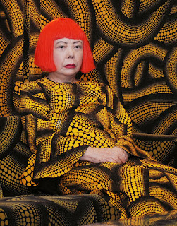
The other artist is Yayoi Kasuma.


She is most known for her oddly phallic polka dot covered soft objects and the fact that she lives in a mental institute by choice. What I find most interesting about her is her installation work. Above is an image of her inside her Yellow Tree furniture room. A quick Google search turns up amazing images. Below is a photo of her current exhibit at The Whitney. The room is called Fireflies on the Water.


The effect is achieved through mirrors, water, and hanging lights. One viewer is allowed into the room at a time. For one minute you can stand there, on what seems to be a small pier and float in the space. Only a minute. New Yorkers are waiting up to 4 hours to have the chance to experience it. I can't blame them.


Dust Jacket is a sometime article about the design and art of book covers. The idea is to shine a spotlight on the work of the designer separate from the author. Literally judging a book by its cover.

24 March 2011

Reflex

I'm sure you've heard of this new social app Color.

Today, a poem, about color.

Not "in honor" or "inspired by" so much as on topic.

For the record, the idea of an all-seeing eye app on my or anyone's phone? I'm so not into it. I like the idea of having access to crowd-sourced photos at a public event I am at but I do not like the idea of my life being crowd-sourced.

The concept of a social network that helps you meet new people and isn't primarily about sex is great. The incremental knocks to private life being private are not.

That being said...I bet this thing blows up big time.


Reflex (ROYGBIV) 3/24

Blood color – a face in darkness
you are the epitome of someone
I want naked

Citrus and juice running down
my chin – there is a field and
it is filling

with dandelion – a cluster of
dairy land – a boy in stiff
pants

In March everything is winter
still is slow turning – the fields
are first to push the eyes

Amish people is their pressed
overalls – on the line drying –
your eyes – his

are pressed corn flowers – are
the sound of wind in fields of
wheat – the smell of

straw and horses
The leaves of the plant are felt
are cat ears – everything white

08 April 2010

Oxford Blue

Oxford Blue 4/7

Spaces between bricks
filled with old sidewalk
Imagine gum stains
spirals in firework shapes
Red rectangles blacking
in sun behind curtains
The dry brown fingers
that were ivy cling
Pry at the spaces and beg
to dig at the books inside

05 December 2009

01 October 2009

List as train of thought

This was an experiment. I started out thinking about an episode of Mad Men that featured a Mark Rothko very prominently. In keeping with the nature of the poems I am posting I decided to enter a random color with Rothko into Google. I followed that with the first thing I thought of after that...oddly Jell-O.

Here are the five searches I did, in order:

Rothko Blue
Stained Glass Jell-O
NYC Subway Tiles
Train Maps
Maps Are Art