Varassamy is a French designer and Servomuto are a design duo that collaborate with artists to create vintage inspired lampshades. I want all of their work in my home.
Everyware is a group of computer artists in Seoul. They exhibit their interactive designs all over the world. Soak is a soft sculpture that starts as a blank canvas, as viewers touch it, color spreads from the touch points.
They found 230 million-year-old bugs inside small droplets of amber in northern Italy. They found three after searching through 70,000 amber drops. They are only 6 millimeters across.
Lately there has been a problem with my brains. They are not firing on all cylinders. Or some other metaphor for things working slightly off-kilter.
In general, I'm a lazy person. By that, I mean that I am not likely to shower or dress unless I have to. Unless I am going to work, and even then, I may wear dirty pants. I like my personal space. I sit and listen to music and read or write most days. When I'm not writing or reading I'm watching Jessica Fletcher kick crime's ass.
She'll kick your ass so hard you'll thank her.
Lately though, I've been so unmotivated that I'm starting to call it a block. A strange success block. Like I'm afraid of it.
I mentioned in Friday's post that I was looking for an agent. For the novel I wrote. And I sent to 12 agents in a burst of magnificent energy three weeks ago. It was beautiful, hopeful, I wrote a query letter and sent it. I got 4 rejections and the rest are ? for now.
Then I turned off.
I do this with submitting poetry. When asked about it I say things like 'I hate the game of it' or 'It's just so heartbreaking' and it is true that the game is sort stupid and I do find it soul-crushing/saddening.
But that is no excuse for not allowing myself to become the great American writer I know that I am. But I cannot seem to reignite the fire that I had when I was 22. When I was sending poems out all the time, by mail. Collecting a stack of rejections that I treasured with the utmost sincerity. They were markers on the road to something.
Today I cannot tell you where those letters are. The beautiful one Brenda Shaughnessy wrote me from Tin House. The terrible slip of laminated paper from Poetry. All gone.
What happened? When did I become someone less interested in this supposed writing career that I ran away from home at 18 to go get? Am I in danger of being one of those people who 'used to write'?
I hate rhetorical questions. That creepy hook of a ? hanging there on the car door of a sentence just inches from the young co-ed that is my thought process.
But that process has vanished for me. Right now I have a finished novel and hundreds of poems just taking up hard drive space and instead of sending to magazines or fighting for something more than the 100 or so page views a day I get here. I am thinking about a plan B.
And it isn't even because I don't have faith in the work.
Your poems are ho shit.
I love my poems. When they are good they will kick your poems asses and then tell them that they liked it. They pity da fool that is your iamb or whatever stupid shit you're working on these days because frankly they are just too damn good to care.
I just don't appear to have the ability to kick my own ass. So I need to figure that out. Suggestions?
This is a novel about an FBI agent and an IRS lawyer falling in love while investigating a ponzi scheme.
And that is both set-up and punchline. Thank you, I'll be here all week.
Julie Garwood started out writing historical romance and has moved into modern romantic thrillers. She's had 24 New York Times Bestsellers and has written 30 novels.
This sort of 'ripped from the headlines' tale is the stuff of Law and Order episodes. It feels oddly easy and boring from a writing perspective. Take news story A and join with news story B, lather, repeat.
I'm not even talking about the romance genre. I have no problem with romance, they have their place. I feel like in the new post-50 Shades world we live in there will be many of these sort of suit and tie romance books tossed down the pike.
Sellers is my attempt to examine what books are topping the best-seller list and why. To talk about and understand the trends in popular writing.
NASA discovered small dino tracks in their literal backyard. The Christian Science Monitor discusses it here. The feet in question belonged to a nodosaur.
Which was a giant spiked armadillo apparently.
Also, someone buy this blanket for me right this second. It's not my birthday or anything important, but really, I need it.
3) Racism
I really really hate Michael Chabon's new book. Like so much so that I may decide it isn't worth finishing. I really want to write a review but it's like totes not good y'all.
There is a LONG post about this that I am working on in my head about racism, white privilege, and the place of artistic licence in all of it but...it's questionable career-wise considering I have sent a query to his agent to rep my novel...
Yes, I just wrote that and meant it. Oh the pitfalls of the industry! Life is so hard! Le sigh.
I hurt my shoulder and am super lazy this week. SO take that rerun of a poem-a-day and I will post something great on Friday.
Also. I'm in DC this weekend, so posts may be a bit random the next few days, but they will show up on Friday and Monday, just not necessarily on time.
K?
K.
This poem first appeared on October 12, 2009. Whirligig (10/12)
This pen winds up the world clocks the birds and makes heaven tilt
On the back the key slowly spinning A hole is an iris then an opening then a flower in bloom
Inside the world are springs this language is making the universe darken then lighten
It comes back on itself this pen will write into a corner then invent the corner and then make a door then invent the opening of the door
This pen is its own key it has teeth and eyes and knows
Publishers send out advanced copies of most books. They go to reviewers, famous people who may give a good cover blurb, booksellers, etc. An advance copy is usually privately published and distributed by the publishing house and is more than likely an uncorrected proof. Errors and all. The typesetting is odd, the print is large, the cover is not finished, but there is it. A book.
This is Michael Chabon's new book. It comes out September 11th. I bring this up because I have found myself in possession of an advance reader edition of it and have waded 50 or so pages in. It's alright so far, I'll review it sometime right before it comes out.
This isn't the first advanced copy I have fallen into.
Back in 2008 I stumbled on a copy of Neil Gaiman's The Graveyard Book on the street about a month before it came out. The average advance copy is sent out up to 3 months prior to publication. This gives reviewers a huge window to get their reading/shredding of said reading done. So it isn't unusual to find these books at used-bookstores or on the street here in Brooklyn.
There are lots of editors/pretend editors in Brooklyn.
The final edition of Gaiman's book had lovely illustrations in it by Dave McKean.
My street-found edition does not. The page numbers don't match up to the final and the cover is missing the pretty silver foil effect on the words. But, the book is a magical read even in that rough form. Once I saw the illustrations there was a part of me that felt cheated, like I wanted to go out and buy the 'real' version but how can you trade in that great dog-eared free copy for a slick new one?
I also like the idea that the copy of the book I'm reading was read by someone 'important'. Someone, one of the luck 5,000 who receive advance copies, touched, read, and maybe reviewed this book I'm reading. And unlike great found books with marginalia and names scrawled in them, these advance reader books are nameless, blind. You have to imagine who read it.
That makes it so odd and fun.
Check out the shelves in the basement at The Strand or on eBay. You can find a trove of these things. Some become collectibles, so that's a plus to this hidden side of publishing.
This UNESCO project preserves important documents around the world. The idea is to save cultural moments that are on paper so that in a few thousand years our important thoughts don't resemble those we've found in Egypt. The website is thorough and lists every object they have preserved. These include Tesla's papers and photographs of Palestinian refugees.
Late at night the rain
against the leaves
soft foam sound
Amongst them the drum beats
far off and then the light of fire
When eyes are closed
and the cool air swirls
about your naked chest
There is the sense that this
eternal war will cease in our lifetimes
That the endless glow
of sword on breastbone
will ember and ash
That whatever horse we crawled out of could take us back in
14 August 2012
If you haven't yet, please take a look at Hayley's guest post.
I mentioned in my Friday post that Michael Chabon's new book Telegraph Avenue is coming out in September. I scored an advanced copy and will be posting a review/discussion of Chabon sometime at the start of September.
Next month's Re-Read is still up int he air. I'm trying to decide between two books. I don't have a copy of either of them though so I may have to delay the picking until I can grab something from the library. Will keep you updated,
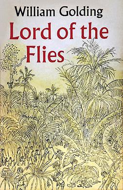
A pig's head impaled on a stick delivers a sermon, flies tumbling from its mouth, to a young boy.
A pair of cracked glasses held to the light of the sun.
A bleached white conch shell trumpeting through the remote island forests.
The images in Golding's book are burned into my memory. The island, the insanity that follows. The sudden interruption of rescue at the end that tacitly implies that the world as a whole is just like those boys. Loose, falling apart, afraid.
Penguin cover 1980
What I forgot, or more accurately, what I didn't see the first time I read was the clear homo-eroticism of the boys. Simon clearly loves Ralph. There are numerous scenes of arm caressing and longing looks. Ralph and Jack clearly have a love/hate relationship. They even argue like an old married couple. Piggy looks to all of them for affection and only receives abuse. They are all nearly naked or actually naked at various points and each boy is described in longing, Whitman-esque terms.
Golding's writing holds up fairly well. It is a book set in the 40s and there are certainly a lot of references that date the story, but that only made the re-read more interesting for me. The thought that these were events in the past only made it harder to detach. I had to contend with these kids going home and shaping the world we now live in.
Which is scary, but explains EVERYTHING.
If you haven't seen it, take a moment to watch the great 1963 Peter Brook film. The whole thing is on YouTube. Below is the trailer.
Re-Read is a sometime article where I go back and read a book from my childhood over and examine the threads that I find in my current adult life.
This book is the fruit of a blog entry from last year. Carrie Goldman's daughter was being bullied for taking a Star Wars lunchbox to school because apparently Star Wars is a 'boys' thing. The internet exploded in love for the 1st grader and her mom got a book deal. All in all, good things from bad.
A historical novel about Edith Wharton and her life-long friendship with her governess Anna Bahlmann. This book centers on what happened when Wharton fell in love with Morton Fullerton and it drove a wedge between her and Anna.
Looking further ahead, Penguin releases the new Zadie Smith, NWon September 4th. I'm not a huge fan of her work, but the interest is still there to see what she's up to.
More excitingly the new Michael Chabon, Telegraph Avenue , arrives on September 11th from Harper Collins which is the same day that Riverhead publishes Junot Diaz' This is How You Lose Her. I have loved every book I have encountered from these guys and cannot recommend them enough.
Phenomenology of Perception (1945) Designed by: Keenan I've highlighted the work of Jaime Keenan before. That time I was discussing an example of his work that I felt fell flat. He is a great designer and this, I hope, highlights that. If the cover looks familiar it is because it should. Over the years of public education you were perhaps taken into various rooms and given tests. One where you put headphones on and were asked to raise your hand when you heard a tone, one for scolio, and the one depicted on this cover. The Ishihara Color Test. The image on the cover is plate number 9. It shows a 74. If you are partially color blind you may see a 21. If you are full color blind you will see nothing. The Ishihara test was invented by Japanese ophthalmologist Shinobu Ishihara in 1917. The test was initially used by the Japanese military to test recruits. The first charts were hand-painted by Ishihara with water colors. As I said this is an example of a great cover designed by Keenan. The book is Merleau-Ponty's work on perception and how the body is a prime focus for how man deals with the world. What better way then to showcase the ultimate test of perception. There are also cases where physical damage to the eye can result in color blindness, damage to the body and how it changes perception features in the book as well. All these dots have me thinking about two artists, both deal with perception and use spots to interpret the world. The first is Chuck Close, whose images closely resemble the Ishihara Test in the way they use the different-sized circles to crate an overall image.
Lucas (1986-1987)
While it doesn't matter really in the discussion it is worth noting that Close is a man who started his career fully able-bodied then suffered a severe spinal injury that left him paralyzed. This was 20 years into his career.
Close also suffers from Prosopagnosia, which is face blindness. He does not recognize faces. He is a master painter of faces but does not recognize them. I am sure Merleau-Ponty would have things to say about that.
She is most known for her oddly phallic polka dot covered soft objects and the fact that she lives in a mental institute by choice. What I find most interesting about her is her installation work. Above is an image of her inside her Yellow Tree furniture room. A quick Google search turns up amazing images. Below is a photo of her current exhibit at The Whitney. The room is called Fireflies on the Water.
The effect is achieved through mirrors, water, and hanging lights. One viewer is allowed into the room at a time. For one minute you can stand there, on what seems to be a small pier and float in the space. Only a minute. New Yorkers are waiting up to 4 hours to have the chance to experience it. I can't blame them.
Dust Jacket is a sometime article about the design and art of book covers. The idea is to shine a spotlight on the work of the designer separate from the author. Literally judging a book by its cover.
Lolita, since I read it in my very early twenties, has been one of my absolute favorite books. The language is so masterfully and exquisitely manipulative! I read it at least once a year, sometimes more than once. I've found that the more I experience this story, my courtship with it changes. I don't think that this is an uncommon phenomenon. It's one of those books that makes you heartbroken no matter which character you're siding with--Lo, Charlotte, or Humself.
The first copy I purchased, now incredibly worn and wrinkled, features an ankle in a folded sock slid inside a saddle shoe. It’s an evocative image to be sure, but certainly not the most successful cover. In my opinion, the ankle-sock-shoe-skirt image is a little too easy and it simplifies the book’s contents. This book broods and swings moods. It breaks hearts and commits murder. It’s not just a story about a little girl and a pedophile; it’s a tragic and broken love story and the image of an ankle sock somehow just doesn’t do it justice. This is something I find common when it comes to covering it. As readers we should remember that Lolita is a dangerous book and the cover should reflect love, danger, heartbreak, sex and innocence. It’s a tall order.
Perhaps it’s easy to talk about my first cover selection, because I believe it’s the most iconic. But icons are icons for a reason. This image of Lolita with her heart-shaped sunglasses first appeared as a movie poster for the Stanley Kubrick version of the film that was made in 1962. It has since been the cover of the book for multiple editions in several languages.
Here we see Lo peering over a pair of red, heart-shaped sunglasses. The look in her eyes suggests that she is just about to cross the cusp of innocence into something entirely more dangerous. She is definitely giving off a curious vibe. And let us not forget that lovely lollipop. Lo’s lips are absorbing both its color and flavor. She’s not chewing on it like a greedy child; she’s tasting and teasing. Collectively, this image works because it is showing rather than telling readers what to think. And what does it show us? Lolita, suspended in her world, yet peering curiously into Hum’s.
If there were ever two things that should be united it’s the work of Balthus and the text of Lolita; they’re a perfect match. Nabokov was a genius and Balthus was some painter!
The image that chosen for the 1995, Penguin edition of the book was a work by Balthus titled Girl and Cat. It was painted in 1937 before the book existed, but seems to fit the text perfectly. It’s as if the two were just waiting to hold hands with each other. Although, many of his paintings show young girls in erotic contexts (please see The Guitar Lesson…whoa), Balthus often claimed that his paintings were not erotic, but rather exhibited the uncomfortable fact of children’s sexuality.
Exhibit A!
Here we see a girl who, in the context of the book cover, we can safely assume is Lolita. This is a different Lolita than the one with candy and glasses, though (remember the mood swings I mentioned earlier?). This Lolita looks disheveled; one of her sleeves is pushed up, as well as her skirt. Her body language does not match the look on her face. Her legs are splayed open and inviting, but her face is not. She looks sad, a little weary, and if she’s preparing herself for what’s to come; enter Humbert. Ladies and gentlemen of the jury, look at this tangle…indeed.
Last, but not least…In 2009, John Bertram'sVenus Febriculosa held a contest to redesign the cover of Lolita. The idea behind the contest was to see what artists and designers would come up with when they were free of editors’ and publishers’ constraints. Many of the newly designed covers use text as image and many of them play with some of the iconic images we’ve seen previously, like the heart-shaped glasses and the lollipops. A lot of them feature butterflies—Nabokov was a devoted lepidopterist. Some of the covers hit the mark precisely and others, well, they look all curlicued and sappy.
In my opinion, the most successful of these redesigned covers is that of Egor Krasnoperov. It really is quite marvelous. It combines simple lines and curves to create several different images. Dead center we see the shape of a lollipop, which also resembles a target. Veering out from this red, circular image are three strategic lines. The top two form a “V” shape, the last stems down right in the center making this image resemble a young girl’s genitalia placed between thighs. This image is simple, beautiful, and completely dangerous. It makes us look longer. It makes us uncomfortable. It makes us ask questions. All of these things make Kroasnoperov’s cover wildly successful, and dare I say it, my most favorite to date.
- Hayley Heaton is an avid flaneur, as well as a poet and playwright. She lives in the middle of nowhere and loves to eat grilled cheese sandwiches.
This project by Shing Tat Chung attempts to show us the folly of the investment world. With an £4828.88 initial investment from a pool of 144 people around the world a computer is using superstition and an algorithm of luck to make bets on the stock market for one year.
The computer started trading in June, there is a live board tracking progress on display at the Royal College of Art in London.
I found this on Boing Boing so apologies if you already saw it.
What did Joanna Lumley do before AbFab? Well, for one she starred in this amazing, moody 1979-1982 scifi series with David McCallum. Below is part one of the final episode. It's about 90 min to watch all 21 parts and is so worth your time.
In April of this year I discussed my general dislike of books like the ones Jonah Lehrer is known for. That sort of pop science self-helpish book that takes a subject like creativity and runs out the clock discussing it at length.
And there is nothing really honestly wrong with these books. As I said then, they are entertainment, they get you interested in random acts of science. Radiolab, my favorite podcast, is essentially this format. It leans more on the science end of things though.
As you may have heard, Lehrer was caught lying. Michael C. Moynihan's report appeared in Tablet on Monday. In that article Moynihan details that Lehrer fabricated Bob Dylan quotes in his most recent book, Imagine. This is the book I talked about back in April.
Lehrer was fired/quit his staff writing job at the The New Yorker the same day. In that run-down from the New York Times it is pointed out the Lehrer was just one month ago called out for recycling some of his own writing in New Yorker blog posts. While this isn't a terrible thing, remixing your own work as if it is new is an odd choice for a bestselling author.
That is the trailer for Shattered Glass, the film made about Stephen Glass post-scandal. It's an all right movie about an interesting subject. The film is more interesting historically as Hayden Christensen's attempt to un-Star Wars himself.
I guess all of this is a long introduction to me getting to my real questions about these events in journalism. That is:
Where is the line between journalism and literary non-fiction? What sense of truthfulness must an author adhere to with a non-fiction book? Does the lie alter the argument?
Let's get the first one out of the way. The line between journalism and non-fiction is clear for me. Journalism should present the truth. This is why Glass deserved to lose his job and be driven from the industry wholesale. I am not for dry writing, but I am a 'just the facts ma'am' type of guy.
The second question is harder. In a book, that is meant to convey an argument. Meant to present a side of a story. To that effect, I think it's OK for a little fudging to occur. This is where I fall on Frey. He didn't really hurt anyone. His lies were there to make a good story, and people seemed to react to it. I fall in this area on the whole JT LeRoy thing too. I'm not going to go into it here but a middle-aged woman pretended to be a drug-addicted male teenager. Again, I don't care, I like the creativity involved and approve completely.
The final question is the trickiest. I don't know what the false Dylan quotes were or how they fit into the larger picture of Lehrer's book. But this was a lie about a living person. A very famous, very studied, person. While I think a little fudging is fine. This is not. A small lie to add oomph to an argument can be OK in the right instances. Clearly Lehrer has not learned how to pick these out and has been given a public lesson on it.


