Showing posts with label art. Show all posts

10 December 2016

Poem-A-Day #285 : The Alarm is Going

The Alarm is Going

The alarm is going again -

It has been 15 years 8 years 2 years 1 month -
                    it was yesterday -

I stood in front of the Madonna - the one from 1290
Duccio
               - the painting is on peeling wood

Around her head the gold is sculpture - it is an object grown - the tree gave birth to this fully framed woman

The child reaches for her veil -
                    not yet - not yet -

A etches across the surface - it highlights her sadness - is a weight on her
like the oddly proportioned child -

          too small - too adult looking - a doll really

He reaches for her veil -
continues to reach -

You died on this day - or that day -

                                        the alarm is going again - I am not sleeping -

                         I blame the moon for this - it gets fucked by us too often - blamed for all atrocities - I blame it and the light it steals - the fucking rabbit that lives upon its face -

The rabbit hitched a ride on the back of the heron
          its small white paws going raw from the gravity of what they were doing

they landed and the rabbit reached one bloody hand towards the heron's face
and marked it forever -

The alarm has been going for hours -
                    and I feel like I should have burned up by now

Death isn't fear -

          at least not on the surface - I like to think that I understand this but -

The child reaches for the mother's veil -

                    His hand touches the edge of the loose fabric - blue and shimmering -
          his oddly small fingers pull at the edge - her eyes reveal themselves -

The leaves of gold peel steadily -


Madonna & Child (1290-1300)
Duccio

16 September 2016

Poem-A-Day #199 : Instructions for How to Engage with Art

Instructions for How to Engage with Art

The canvas wants you to touch it
to run your fingers against the raised strokes

Feel the ochre burnt and otherwise

It wants you to lose yourself in it
to become so encased in its universe
that you will not escape unchanged or at all

It wants to yellow wallpaper you

All of this is contingent on the artist
understanding the canvas well enough
to reveal the need within it

All of this requires you to step closer

To press your chest against the Mona Lisa and to search for her pulse
Take your clothes off and jump into The Water Lilly Pond

Be naked and covered


05 April 2016

Poem-A-Day #36 : O'Hara

O'Hara

MoMA the battlefield, the broken edifice

I am looking for O’Hara – there must be stains

Some part of his newspaper in a corner – something
about the day that Hart Crane died

There are only cell phones stalking the Van Goughs
Yoko Ono’s invisible instructions

            scream.
1.     against the wind
2.     against the wall
3.     against the sky

29 March 2016

Poem-A-Day #29 : Second Life

Second Life

I gave him dark green pants and a brocade vest
          I think the shirt was muddy brown - loose fitting - linen
                    Lace up shoes and then we were standing on an outcropping that
overlooked a great rocky valley          everything green and white and tree-covered
Do you remember the signs          We walked down a long trail
passing by them - they had paper pinned to them
          curling at the edges - the words were blurred were gray were script about how to walk
                     how to move in the space - walk further          faster          careful
                     The world is populated
                     There are others walking this path          ahead is a mass of gray
                               you expect it to be castles          it is skyscrapers
           Buildings labeled Embassy - University - Nightclub -
           Who is there today -
                                                                        Aside from the empty space
                                                              and the pixels.

30 September 2013

Dust Jacket : Every Day

Every Day
Jacket art by: Adam Abernathy

I love me some black and white photography. Even more so if the tone of the print is icy cold.

The cover to this really great young adult novel takes those loves and adds another - off-white paper.

In these covers posts I don't usually read the book I'm talking about. It's meant to be about the design only.

BUT. Read this book.

David Levithan is a great author. Every Day is about a person who wakes up a different teenager each day. Different sex, different race, different everything. The main character falls in love and must overcome the weirdness of the relationship. It manages to be a perfect metaphor for general teen angst, transgender issues, gay issues, etc. So so so so good. Read now.

Now that I got my infomercial out of the way.

This cover immediately reminds me of:

Garnet Lake (2010) - Peter Essick
And:
 Person Floating - Jens Sage
The sense of wonder in it. Of drifting. It is beautiful.

Outside of the photo work, the use of a window motif makes the whole thing feel like we, the reader holding the book, are watching this scene from inside our own home. Do we open the window or not?

It's a nice visual nod to the role of reader and author. That promise that something awesome may lie inside. If you open the cover.


Dust Jacket is a sometime article about the design and art of book covers. The idea is to shine a spotlight on the work of the designer separate from the author. Literally judging a book by its cover.

13 May 2013

Dust Jacket : The Last Policeman

The Last Policeman
Designed by: Doogie Horner

First thing's first. This cover was designed by a stand-up comedian. Who was on America's Got Talent. The same man who designed the cover for Pride and Prejudice and Zombies.

So that is a thing.

More importantly the cover is a simplistic act of beauty. The sort of newspaper feel of it, the letters being burned away as the comet glides across it. It communicates the story without giving anything away.

This will be an apocalyptic novel. Things will burn.
It will be about that.

There is an almost comic book feeling to the work. The drawing of the letters, reminds me of The Human Torch. His fire always represented by a bunch of wavy lines rendered in reds and oranges.


The sheer simplicity of the cover catches the eye. I love a good text-based cover and this one manages to be one of the most simplistic and also most evocative.

Sadly this cover no longer exists. The author, Ben H. Winters and Quirk books recently announced that this was the first book in a trilogy. With the announcement came a new cover.


The new cover was also done by Doogie Horner. I couldn't locate information on who took the photos.

This new cover is also really good. It communicates that the book is about something weird. That there is a comet, that the world will not be the same because of it. And a good photo-based cover is welcome. Too often they are silly or used only for bargain books.

But this cover looses something of the original. It starts to look like an ad for a TV show.

The second book comes out this summer, and the new cover treatment carries through. Which is good.

I feel like there is a missed opportunity to utilize the simplicity of the first book. They could have carried that idea through just as well. A different color scheme or a closer drawing of the comet. Or any other number of ideas.

The photos on the cover evoke the work of Gregory Crewdson, specifically this one. The sort of surreal suburban magic realism of it makes sense. This is not a bad thing, in fact it's the best part of the cover. It also calls to mind the Chris Van Allsburg illustration, "The House on Maple Street".

I assume that Doogie Horner knows his illustration history. The Van Allsburg image appears in a book about a mysterious illustrator who drops off his work then goes missing. The book attempts to piece together the 'mystery'. Stephen King used the same image of Maple Street to write a short story with the same title.

That Horner would pull from these places to create a cover is not surprising. The surprise is that I like the less referential cover more.

EDIT:
On Thursday the New York Times ran a short slide show on the book design process. There is a gallery of rejected vs. final covers. Definitely worth a look.


Dust Jacket is a sometime article about the design and art of book covers. The idea is to shine a spotlight on the work of the designer separate from the author. Literally judging a book by its cover.

09 May 2013

Tattoo

On Friday the New York Times published the latest entry in their My Story series. It was by Louise Rafkin and called Forever, The Girl With The Unicorn Tattoo. Basics out of the way. She regrets her poorly drawn, ill-placed tattoo. Here, the ending of her essay:
Beyond my self-appointed mission to thwart young people from joining the tribes of the inked, my tattoo underscores a lesson I’ve had to learn time and again: some things in life are hard to undo. 
And for those who glibly claim that youthful indiscretions fade with time, I say this: sometimes not enough.
You don't really need to read the rest. Two things:

1) So tired of people pointing to tattoos and saying they are 'bad'. Just. YAWN.

2) She got a tattoo of a UNICORN that was traced from a coloring book. And she got it in GREEN on her ASS.

Of course your ass tattoo deformed with age. Of course it faded into a blobby thing. DUH DUH DUH DUH DUH. I am sorry that you and your friends got trampy overly girly tattoos that you regret. But. You do not know my life. Or anyone else's.

Rafkin projects her personal experience really out past the point of sense. She says that these 'youthful indiscretions' are not a good idea. That universally tattoos are bad decisions. Because she got a unicorn on her ass.

Yes, getting stupid tattoos is a bad decision. Just ask the folks with butterflies on the small of their back. Or the dude with a Tasmania Devil on his shoulder. Or...that guy up there with the Romney logo on his face.

But if it is meaningful, well done, and placed right - a tattoo can be amazing.

This woman had breast cancer and decided against implants. Instead, she opted for an amazing representation of beauty in the face of great personal loss.

Interestingly, Facebook took the photo down claiming it was 'offensive'.

And maybe I'm being hard on the cartoon tattoo folk of the world. Maybe Taz means a lot to some people.

I have 3. They all have great personal meaning. A story to with them.

Two I got in my early 20s and one in my early 30s. I plan on others. With time, the edges have softened and the color has faded. But I love them.

People are dumb. They do impulsive, irrational, hard to explain things daily. That some seem incapable of critical thinking is my take away from this essay and from pictures like the man with the Romney logo on his head.

That is the lesson that Rafkin should have learned. For the record, I think you could easily get a great unicorn tattoo. I don't know what that would look like and this Google search is a hot mess.

A tattoo should be like those of the Illustrated Man in Ray Bradbury's classic book of stories. Each with a tale to tell. A future and past to showcase. Even a bad one. Those stories are important too. And wishing them away is missing the point.

We make decisions. They impact us. We cannot erase or eliminate ourselves in this way. And even if it gets all discolored and blobby. That history got us here. We can point to it, even if it is on our ass, and say "I did this. This is when, where, how, and why." Even that guy with the Romney tattoo can look in the mirror and know what 2012 meant for him. That's more than a lot of people can say.

08 April 2013

Dust Jacket : A Guide To Being Born

A Guide to Being Born
Designed by: Alex Murto
Illustration by: Lou Beach

Alex Murto designed that typeface, called Effing, that was meant to be sexual that floated around the internet a few months ago. His covers tend to be the 'take a nice illustration or typeface and put it together' type.

There is nothing wrong with this. It makes good covers. This is one of them.

But it has zero to do with Murto. As far as I can tell, he added flowers to the original illustration by Lou Beach and softened the colors to make it look more three dimensional.

Which...I guess...

The whole point of Beach's work is that it looks like weird acid-trip versions of Victorian illustration. The flatness is part of the aesthetic. Beach is trying to reference specific things from our past.

Old advertising, medical diagrams, religious icons.

Like this ad for Maidenform from the 1950s. They did a long campaign of 'I dreamed I...' ads. The idea was that you could do ANYTHING in these bras.

Take a look at this ad though. There are women in bras wearing animal heads.

It's hard to compete with that today. If this ad showed up in Vogue next month people would go crazy over it. It is weird. And not average weird, very very very weird.

But also really kinda amazing. Like frame it on the wall amazing.

Which is why Beach does what he do.

His recent book 420 Characters (Houghton Mifflin Harcourt 2011) was one of my favorite odd finds of last year. It features 160 stories of only 420 characters. At one point Facebook limited the characters in posts to this number. Beach posted these as his status.

The book features his collage illustrations along side the stories:

Many are animal-headed men and women in various Victorian and mid-century costume.

If I hadn't told you the ad above was real, you would be excused for thinking it was his work.

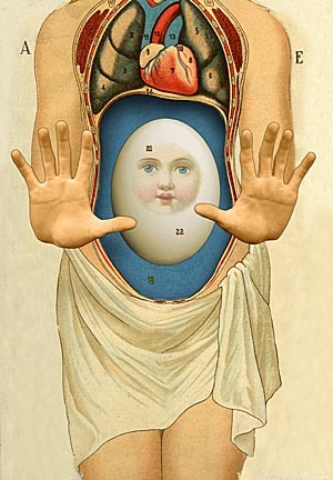
A lot of his work, the cover illustration included, incorporates a sense of the medical drawing. Reminiscent of Gray's Anatomy.

I think of the times I have gone to the acupuncturist and stared at the charts. Thinking that they are beautiful and terrifying. The same experience occurs in doctors offices. The charts and ads on their walls a constant reminder of the ways a body can deteriorate and fall apart.

Victorian illustration of cadavers and medical equipment are striking. For their bluntness. Their shocking realism. The acute awareness that the drawing was made of a dead person, that the organs seen were exposed so the illustrator could draw them.

The viscera of it can be felt.

Which, given the oddness of Victorian society and it's prudishness is interesting. That these people would decide that they would turn their noses up at so many things as being 'crude' while demanding this incredible realism in their medicine.

These are the people that brought us the modern form of the seance after all. Modern mysticism in general really.

That mysticism comes through in Beach's work in subtle ways. The cover reminds me of icons of the Virgin Mary. Of old religious relics in general. Something about the egg with a face on it. The pose. The absolute zeal of it.

An exhibit of Frida Kahlo's clothing recently opened at Museo Frida Kahlo in Mexico City. There are corsets, braces, a prosthetic leg. Her flowing native Mexican inspired gowns bring to mind the Virgin. The country and its history.

Beach's work calls back to Kahlo's and further back to Hieronymus Bosch's nightmare-scapes.

These artists juxtapose the beautiful and terrifying to create worlds we want to look at but never want to encounter. The artistic counterpart to the stranger in the alley, the creepy side show, the dream you cannot wake from.

Frida Kahlo's brace/corset.

Dust Jacket is a sometime article about the design and art of book covers. The idea is to shine a spotlight on the work of the designer separate from the author. Literally judging a book by its cover.

05 March 2013

Dolce & Gabbana

Half dome of Cathedral of Monreale

From Tom & Lorenzo
A quick update to my post about Bye-and-Bye yesterday.

The Dolce & Gabbana fall 2013 collection took its inspiration from the Monreale mosaics. A perfect example of the out of context religious icon I was talking about.

The Cathedral of Monreale was begun in 1174. It is one of the best preserved examples of Norman architecture. Every inch of the walls and ceiling is covered in glass tiles.

Dolce & Gabbana are known for their referencing of Sicilian culture in their collections. In recent years they have made the black lace dress highly popular among stars.

I wouldn't mind these heavy, mosaic looking dresses popping up on red carpets and streets. I love the luxurious look of it. I will reiterate that I find the stripping of meaning interesting. Is this crass? Are they being religious? Is it just pretty?

The message is cloudy and that is what makes it interesting.

21 January 2013

Dust Jacket : Yellow World

Yellow World
Design by: Jon Gray (gray 318)

This is a book about surviving cancer. Albert Espinosa survived and wrote a book about imagination as the means of that survival. His 'yellow world'.

A lone world floating in space.

That imagination is a lone planet drifting in the darkness of space is something to think about. Each of us have within us a world separate and equal to everyone else. We are all a constellation, a solar system.

A lot of modern art is about existing in space alone. About the individual experiencing the object. Mark Rothko's Chapel in Houston, Texas is a fine example of meditative art.

Rothko Chapel
You walk into a stark gray room, you are faced with 14 black color field paintings. There are a few benches to sit on. It is pure mediation. Rothko's work requires this. For his paintings to exist as art, the viewer must bring multitudes into the room with them.

In a design week interview, Gray cited Olafur Eliasson as an inspiration for this cover. I certainly see the connection to Eliasson's piece The Weather Project.

That work was installed at Tate Modern in London for 6 months in 2003. It filled their 5-storey 3,400 sq. meter Turbine Hall. I had the chance to visit it.

At the far end of the room was a giant glowing yellow disk. A sun. It floated oddly in the hazy space. The ceiling was mirrored. The floor of Turbine Hall is slanted so as you walked forward the 'sun' seemed to rise. The effect was like staring into the sun, and being oddly closer to it.

Many people would lay near the disk, staring up into the far away mirrored reflection of themselves.

Danny Boyle's movie Sunshine deals with a crew of people attempting to reignite the sun. The mission is suicide. It is a flawed film, the last third is a mess, but the beginning is beautiful. It is about saving everyone, but no one.

There are scenes in the movie of the characters on an observation deck staring at the disk of the sun. Looking at its boiling surface for something akin to a god.

In the movie, the god never arrives. In meditation, you are not looking for god but for an inner truth. A self god.

Yves Klein, Blue Disk 1957
Yves Klein created a lonely blue planet in 1957. His Blue Disk is both stark and rich. Klein wished to visually represent the 'authenticity of the pure idea'.

Purity of idea.

I am reminded of Koans. These thought experiments are meant to illicit the 'great doubt'. A few examples:

'If you meet the Buddha, kill him.'

'Without thinking of good or evil, show me your original face before your mother and father were born.'

The classic we all know:

'Two hands clap and there is a sound. What is the sound of one hand?'

What happens to that yellow world when Espinosa is no longer fighting cancer?

Assuming that the world is a meditative safe place to go to while fighting cancer, does that world vanish when it is no longer needed? Imagination is a tricky place. You can disassemble as easily as assemble.

Maybe the yellow world is a koan. A place that does not exist, created as the means to protect and survive. A place that cannot be fully taken apart once put together. It is perhaps also a scar.

Seen from space our planet seems perfect. Quiet. At peace. Imagination allows us to pretend that this is true. Reality is another matter altogether.


11 January 2013

The moving finger writes; and having writ moves on...

The Rubaiyat of Omar Khayyam is an influential book of Persian poetry. Khayyam lived from 1048-1141. The work spans many years. It is not considered one long poem, though it's parts definitely call back and forth to each other.

There are cups of wine. Food. A beloved. Many scholars point to it as a work of Epicurean ideals. As a strange sort of agnostic, philosophy. It is compared to Lucretius' The Nature of Things. Though it takes a much less academic approach.

Anywhere from 1200-2000 quatrains have been claimed as part of the work. Many of them have questionable origins.

Edward FitzGerald
The poems have been quite influential. Rex Stout, O. Henry, Agatha Christie, Eugene O'Neil,and Stephen King are some of the authors who have titled works after lines from the poems.

D.W. Girffith was about to film a movie version as his follow up to Intolerance but the project fell through. Griffith famously made the not so subtly pro-KKK film, The Birth of a Nation.

It is even featured in The Rocky and Bullwinkle Show.

Edward FitzGerald is responsible for bringing the poem to the English speaking world. Over the course of several decades he would release and then edit and re-release his translations. He grew famous for the work. Mostly because he took great liberties with the lines of poetry. Many called the work FitzOmar because of this.

The connection between the two men was so strong that a rose seed from Khayyam's tomb at Nishapur was planted on FitzGerald's grave in Suffolk.

Translation is a strange game. Because of his tinkering with a Persian work, FitzGerald gave us the Rubaiyat quatrain - AABA rhyme scheme. Also because of it, it is hard to know where the two writers exist on the page. Where is FitzGerals, and where is Khayyam? That gray area is uncomfortable to exist in for some. The question of 'is it right' rises up.

Recently we have seen a large amount of new translations popping up. There is the new In Search of Lost Time, Beowulf, War and Peace. There are new retellings of The Iliad. John Ashbery won praise for his new translation of Rimbaud's Illuminations. Philip Pullman just released a new translation of the Brothers Grimm.

We are in a time of retelling our stories. Dredging the past and re-imagining it in new clothes. Here, then, the opening quatrain from three versions of FitzGerald:

Quatrain XXIV, Edmund Dulac, 1909
1858
Awake! for Morning in the Bowl of Night
Has flung the Stone that puts the Stars to Flight:
And Lo! the Hunter of the East has caught
The Sultan's Turret in a Noose of Light.

1868
Wake! For the Sun behind you Eastern height
Has chased the Session of the Stars from Night;
And, to the field of Heav'n ascending, strikes
The Sultan's Turret with a Shaft of Light.

1872
Wake! For the Sun, who scatter'd into flight
The Stars before him from the Field of Night,
Drives Night along with them from Heav'n, and strikes
The Sultan's Turret with a Shaft of Light.

I like different lines from each. My version would blend the three together.

Edmund Dulac made 20 beautiful illustrations for a 1909 edition of the book. I recently found a 1952 reprint in a local book store.

The book holds a particular fascination for me. I have mentioned before that I love a good mystery. The Rubaiyat is part of one of my favorites. The Taman Shud case of 1948. I have talked about the case in two posts. I wrote a poem about it. It is a very long subject but basically, a man was found dead on a beach in Australia. He was a John Doe. Events quickly got weird.

Here is the final quatrain of The Rubaiyat. The one the case takes its name from:

Torn page found in the man's pocket.
And when Thyself with shining Foot shall pass
Among the Guests Star-scatter'd on the Grass,
And in thy joyous Errand reach the Spot
Where I made one - turn down an empty Glass!

TAMAM SHUD

The final line means 'finished' or 'ended'. They found that last line folded in the dead man's pocket. A suitcase filled with another man's clothes was found as well. A nurse who may have given the book to the dead man refused to help the investigation. They found what looks like a secret code...

The case is strange. It is about circumstance, misidentification, lack of identification, and cover up. What I find interesting about it is the strange set of events that get you from the book to the dead man on the beach.

The events are random, indecipherable from the outside. But all events are that way. Think about how you got to work today. How you picked the college you went to. What your favorite song is and why. To anyone but you, these things are enigmas. Unknowable.

I was in Taos last fall. I wondered into a store that specializes in old maps and prints. They had a huge book of prints from old books of fairy tales. They were amazing. I bought three on a whim.

They were all drawn by Edmund Dulac. They were all from his Rubaiyat. I had no idea until yesterday. When I bought this old book and opened it, staring up at me was a face from the past.

My copy of The Rubaiyat, 1952 Garden City Books

26 November 2012

Dust Jacket : Louise Glück Poems 1962-2012

Louise Glück Poems 1962-2012
Designed by: Gretchen Achilles
Mezzotint by: Vija Celmins

When I first saw Gretchen Achilles' cover for Louise Glück's new collection I thought to myself how perfect the cover was. How it was mysterious. We are coming into orbit of a strange new world. With all the possibilities that that entails.

Simplicity hinting at the complex just out of our reach. This is like Glück's work. Layers are peeled away and things come into focus. Things we thought we knew. That we never could.

Achilles is the owner of Wavetrap Design. She is a freelance designer and has worked for all the major publishers.

Her choice for cover image shows her talent. This is a 1985 mezzotint by Vija Celmins. Celmins was born in Latvia but has lived in the US since she was 10. She works primarily in graphite and is known for her hyper-realistic work.

Darwin 2008-10, oil on canvas

Her space drawings are particularly interesting to me:

Star Field III 1982-83, graphite on acrylic ground on paper

They remind me of work from other artists. Chuck Close comes to mind with his highly detailed paintings and drawings. And Lory Pollina's graphite work:

Noosphere No. 3 2010, graphite on paper

In all these works it feels like something is being revealed while also being kept hidden. It feels like something we have seen before, but is totally alien. Again, this is like Glück's work.

The book covers 50 years of work. It resembles old sci-fi films of the 50s and 60s. It calls to mind great half-true representations of space.


Those half true representations are large in my mind. In the larger culture's mind as well. Below is a photo Cassini took of Saturn in 2006.


It is hard not to picture a space ship moving towards that. Sending a probe out to investigate. Finding an evil creature bent on our destruction.

It's very hard to see in the picture. On the upper left edge of the inner rings is a small blue dot...

Earth.


Dust Jacket is a sometime article about the design and art of book covers. The idea is to shine a spotlight on the work of the designer separate from the author. Literally judging a book by its cover.

07 November 2012

Dust Jacket : Search Sweet Country

Search Sweet Country (1986)
Designed by: Brian McMullen

This is a 25th Anniversary edition from McSweeney's. Brian McMullen is their head artistic director. He also oversees their new children's book division.

The book is set in Ghana. This is important as a starting point for the image on the cover. It is clearly an African textile print. Almost to a generic point.

These printed fabrics are beautiful. It is an obvious reference point when dealing with a book that has been called "one of the greatest novels ever to come out of the African continent". The cover is even more important when you consider that the book follows a large cast of characters.

From McSweeney's book flap:

Bringing to life the bustling markets and bars in dizzying, lyrical prose, Laing weaves a story filled with bizarre and often melancholy characters...Their collective narratives create a portrait of a country where colonialism is dying, but democracy remains elusive.

A patchwork.

Of course McMullen chose to render the fabric in soft greens and browns. Tilted away from the viewer. Softly fading into the horizon.

Northwest Minn 9/09 - NASA Earth Observatory

It's a visual trick that makes it both cloth and farm land. A simple trick, but genius on McMullen's part.

Photos like the one above have always been mesmerizing for me. The weird perfection of our division of space. The OCDness of it. African cloth is just as oddly perfect. The little squares with their conflicting yet harmonious content.

This is the best visual metaphor for writing I have ever seen. Not just for this story, but all stories.


Dust Jacket is a sometime article about the design and art of book covers. The idea is to shine a spotlight on the work of the designer separate from the author. Literally judging a book by its cover.

11 October 2012

Rain Room

Through the use of digital cameras and motion sensors this art installation allows you to walk through a rain storm without getting wet. If you are in London...go see this at the Barbican and tell me about it.


05 October 2012

THIS! 10/5/12

THIS! on October 5th, 2012

FACT! In 1582 there was no October 5th in Italy, Poland, Portugal, or Spain due to the implementation of the Gregorian calendar.


1) Betaville

Betaville is a project by Brooklyn Experimental Media Center. The project is an open-source city planner program that allows anyone to fill in and experiment with open spaces in large urban areas. Right now there is one for New York.

Battery Park of the FUTURE!

The platform allows people to improve each others designs and to play Sim City for real. The hope is to influence and shape real world urban development. I would love to see some of their designs implemented, even half-assed they would be better than most of what exists now.


2) Pre-Raphaelite Brotherhood

Founded in 1848 by William Holman Hunt, John Everett Millais and Dante Gabriel Rossetti this group is widely considered the first 'avant-garde' art movement. The idea was to return to a pre-Raphael style of sharp detail and bright color. They were widely criticized for being medieval. Charles Dickens declared Millais' Christ in the House of His Parents (1850) blasphemous, making the holy family look like 'alcoholics and slum-dwellers'. Oh Dickens, you very British man you.


Working class = alcoholic slum-dweller

28 September 2012

THIS!

THIS!

1) Faking It: Manipulated Photography Before Photoshop

[Room With Eye] 1930 Maurice Tabard


2) Fruit Salad Tree

From their website:

A fruit salad tree, developed by the West Family, who established the Fruit Salad Tree Company in 1990, in New England, New South Wales, Australia, bears up to six different fruits of the same family on the one plant. All fruits retain their own individuality, with staggered ripening times.

There are four types the company offers: stone fruit, citrus, all-apple, all-nashi. You can mix and match and even list your preference in order of the fruit you want dominant on the tree. So far only available in Australia.


3) Stoker


Oldboy is one of my favorite weird movies. Director Chan-wook Park is bringing his particular brand of awesome to the US with Nicole Kidman in tow. Stoker looks creepy. Maybe incestuous? No matter it will be bat-shit great.

19 September 2012

Process : Part 2


The video above shows Riusuke Fukahori preparing works form his exhibit 'Goldfish Salvation' that appeared at the ICN Gallery in London last winter. Fukahori painstakingly paints a layer of the work then covers it in clear resin. He then paints the next layer, and the next, and so on until he has a shockingly realistic work of sculptural painting.

You are probably expecting me to make some sort of parallel between my writing and Fukahori's work. And I easily could. The comparison is right there.

Writing is a layered process. It is slow. You add a layer and then another. Between are bits of mortar. The work is unseen, flat, lifeless, until you add that final layer of glue on top.

I could leave it there and we'd all be happy about it. But I don't think it works like that.

I view writing as a long-form game. Like history. There are maps and charts, and plans, and budgets and steps along the way. But there are also lengthy periods of not much happening. It's those moments that I think matter the most.

I don't write for half the year.

That fact alone probably discredits me to many as a 'serious' writer. As I mentioned in the first post on process, I also don't really plan. These two admissions together make me look a little sloppy in the seriousness department. I recognize this fact and I respect the opinion in it.

Honestly though, I need that time off. After undergrad I didn't write for 6 months. I panicked over it, went without sleep, spoke to my friends, my teachers, I actually thought I had 'lost it'. That mythical thing that brings the words to the tongue. I feared the death of my muse.

Then I started again. Just one day. I picked up a pen and started. And then wrote some amazing stuff for about 10 months or so. Then I broke away from it again.

And I realized after a second moment of panic that this was my method: I sponge for a bit, then spit it out.

Take my novel (the one I'm trying to get an agent for). I thought about it for over two years. And by thought, I mean had the idea sitting there. I didn't actively think on it, but it sat, collecting mind dust until I had four months free to spit the thing onto paper.

And it felt good. It felt like the right time.

Or course this method could lead to things sitting for years. To things not happening. But that happens to people who write every day also.

I did that write every day thing. I know I can. It also felt like work, like a bore. It felt like something I had to, not wanted to. It felt as wrong as a thing could. So I stopped. It took three years, but I did.

So what is my point?

That I think my process of disorganized writing is perhaps closer to Fukahori's process of painting than I initially allowed. That my process is certainly layering. That the time between layers is very drawn out as I wait for the resin to hold. That the paint looks flat, lifeless, definitely unreal. Then I add, eventually, the final layer and it pops into focus. It spins into life.

03 September 2012

Dust Jacket : Schild's Ladder

Schild's Ladder
Designed by: Emma Wallace

A star field. Motes of dust in a shaft of sunlight. Sugar on a table top. Aside from the pitch-perfection of a book about an accidental scientific catastrophe involving molecular replication, this cover by Emma Wallace serves as a void to pour your imagination into. That container for imagination is what a great cover should be. It should inform but not allow you to pre-judge what is going to happen inside.

This looks like a strange close-up and crop of the cover for Frank Bidart's Star Dust.

Which actually makes the cover even more interesting. It creates a strange connection in my brain that works for me.

I wish more cover designs were brave enough to go the no text route. The only real place the title needs to be is the spine. And even there it's only so it can sit on a shelf at a book store. A similar effect can occur with creative use of text.

This is the cover for the hard back edition of Jimmy Corrigan: The Smartest Kid on Earth by Chris Ware. It is disconcerting and confusing to the eye but it sets you up for the flow of the art to come inside, where the reader is asked to follow pages of art and story that look like this:


The paper back edition is similar:

It references the original cover but also manages to clarify the elements.

The art inside Ware's book also reminds me of the Wallace cover. The small dots of ink used to print comics, the multitude of panels on one page that make up the whole. They are like those little spots of white in the field of black.

It's a bit of a reach, but feels right.


Dust Jacket is a sometime article about the design and art of book covers. The idea is to shine a spotlight on the work of the designer separate from the author. Literally judging a book by its cover.

31 August 2012

THIS! 8/31/12

THIS! on August 31, 2012

1) Varassamy/Servomuto Collaboration


Varassamy is a French designer and Servomuto are a design duo that collaborate with artists to create vintage inspired lampshades. I want all of their work in my home.


2) Soak

Everyware is a group of computer artists in Seoul. They exhibit their interactive designs all over the world. Soak is a soft sculpture that starts as a blank canvas, as viewers touch it, color spreads from the touch points.


3) Dinosaur Train

Let's take two awesome things, dinosaurs and trains, and put them together in a show made by Jim Henson Co? YES, PLEASE.

Below is a full episode. You can go to the website to watch clips and other episodes.


There are TOYS!


4) Ancient Bugs

They found 230 million-year-old bugs inside small droplets of amber in northern Italy. They found three after searching through 70,000 amber drops. They are only 6 millimeters across.

08 August 2012

Dust Jacket : Phenomenology of Perception

Phenomenology of Perception (1945)
Designed by: Keenan

I've highlighted the work of Jaime Keenan before. That time I was discussing an example of his work that I felt fell flat. He is a great designer and this, I hope, highlights that.

If the cover looks familiar it is because it should. Over the years of public education you were perhaps taken into various rooms and given tests. One where you put headphones on and were asked to raise your hand when you heard a tone, one for scolio, and the one depicted on this cover.

The Ishihara Color Test. The image on the cover is plate number 9. It shows a 74. If you are partially color blind you may see a 21. If you are full color blind you will see nothing.

The Ishihara test was invented by Japanese ophthalmologist Shinobu Ishihara in 1917. The test was initially used by the Japanese military to test recruits. The first charts were hand-painted by Ishihara with water colors.

As I said this is an example of a great cover designed by Keenan. The book is Merleau-Ponty's work on perception and how the body is a prime focus for how man deals with the world. What better way then to showcase the ultimate test of perception. There are also cases where physical damage to the eye can result in color blindness, damage to the body and how it changes perception features in the book as well.

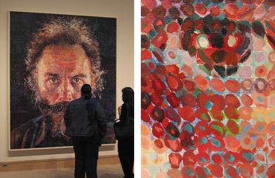
All these dots have me thinking about two artists, both deal with perception and use spots to interpret the world. The first is Chuck Close, whose images closely resemble the Ishihara Test in the way they use the different-sized circles to crate an overall image.

Lucas (1986-1987)

While it doesn't matter really in the discussion it is worth noting that Close is a man who started his career fully able-bodied then suffered a severe spinal injury that left him paralyzed. This was 20 years into his career.

Close also suffers from Prosopagnosia, which is face blindness. He does not recognize faces. He is a master painter of faces but does not recognize them. I am sure Merleau-Ponty would have things to say about that.

The other artist is Yayoi Kasuma.


She is most known for her oddly phallic polka dot covered soft objects and the fact that she lives in a mental institute by choice. What I find most interesting about her is her installation work. Above is an image of her inside her Yellow Tree furniture room. A quick Google search turns up amazing images. Below is a photo of her current exhibit at The Whitney. The room is called Fireflies on the Water.


The effect is achieved through mirrors, water, and hanging lights. One viewer is allowed into the room at a time. For one minute you can stand there, on what seems to be a small pier and float in the space. Only a minute. New Yorkers are waiting up to 4 hours to have the chance to experience it. I can't blame them.


Dust Jacket is a sometime article about the design and art of book covers. The idea is to shine a spotlight on the work of the designer separate from the author. Literally judging a book by its cover.